Note the three areas shown on a normal-sized computer screen:
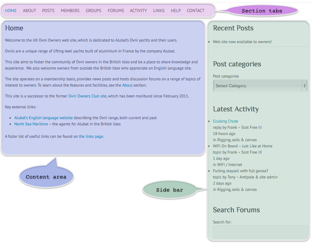 The Section tabs along the top (high-lighted in purple) allow you to choose between the different sections of the site, and the chosen section is displayed in the Content area (blue). On the right is a side-bar (green) which can be used to navigate to content such as posts or topics and to search.
To fit onto a medium-sized screen, such as an iPad, the side-bar is moved down below the content area, so you will need to scroll down below the content area to see it.
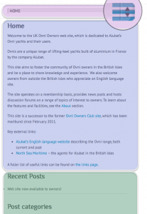 On a small screen, such as a phone, the side-bar is shown at the bottom and the section tabs are reduced to a pop-up menu, as shown here on the right.
On a computer, you can vary your browser window size to see these adjustments. As you make the window smaller, you will first see the side-bar move to the bottom. Then, when the window is smaller still, the section tabs will change to become a pop-up menu.